
Nomia is a document creation and management app intended to take the pain out of managing daily admin within the workspace.
Finchdesign was tasked with creating a slick, simple identity that reflects the fluidity, modularity and ease the user experiences in utilizing Nomia everyday.
Client: Nomia Docs
Corporate Identity & Visual Language
www.nomiadocs.com
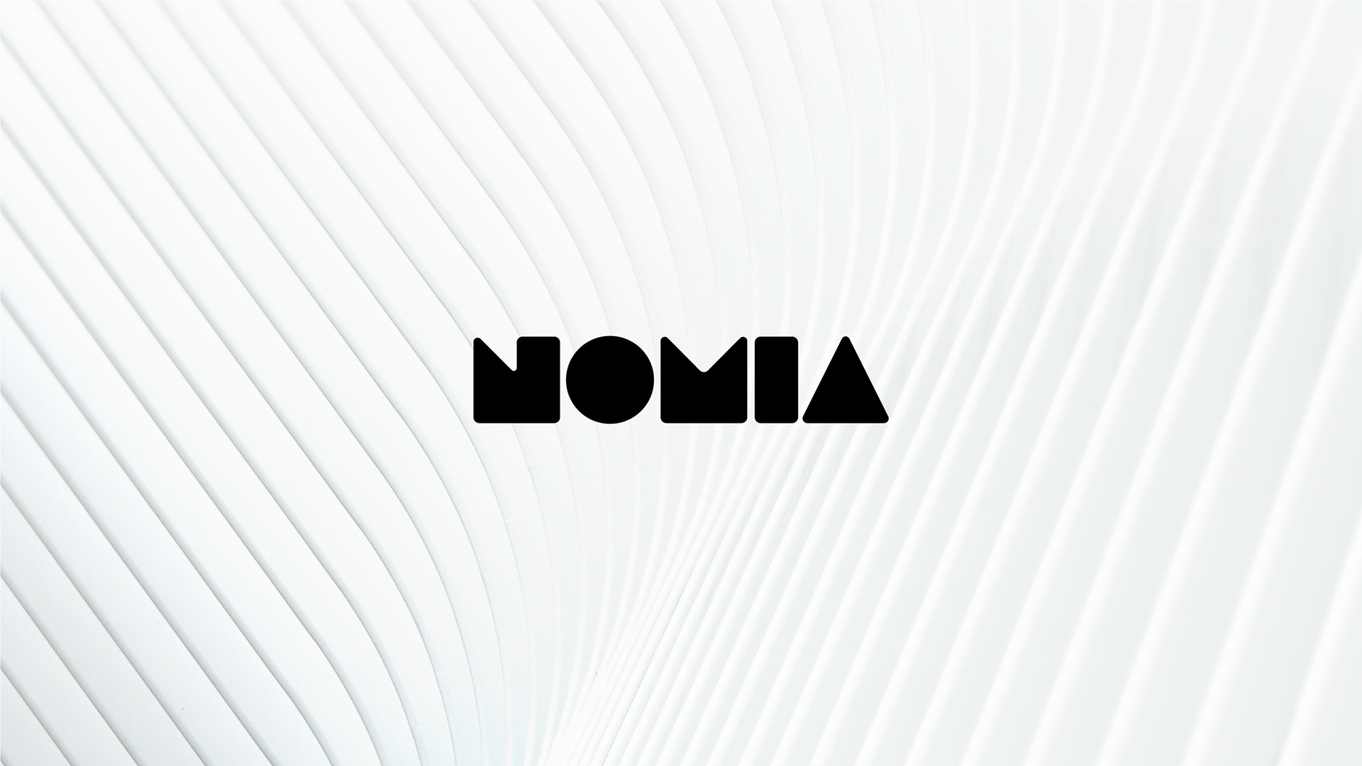
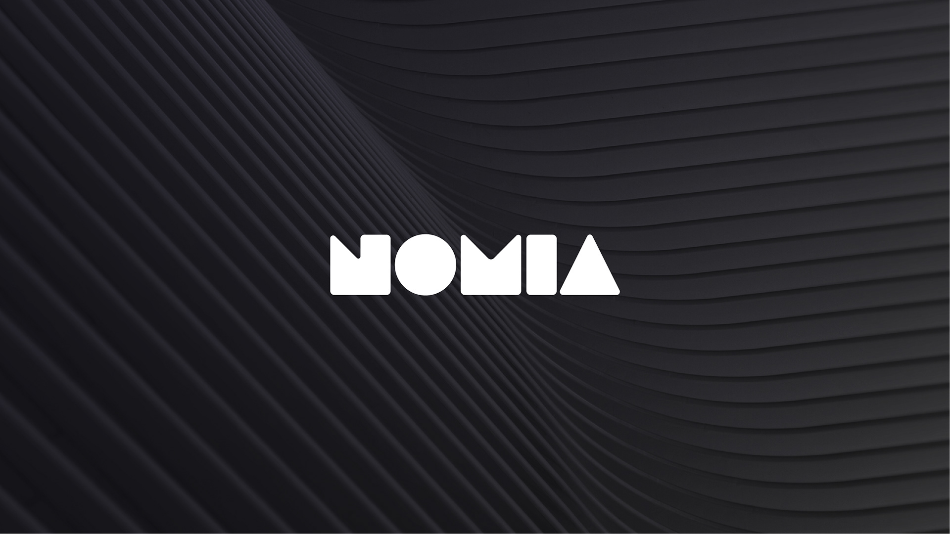
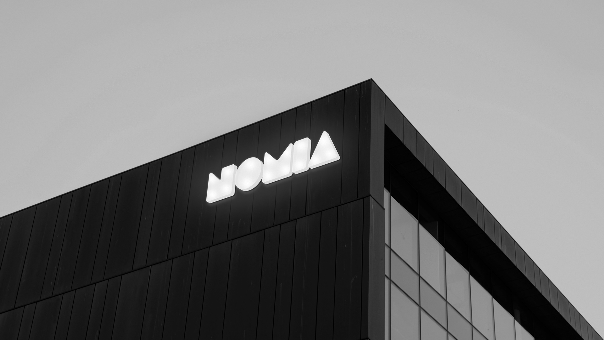
An exercise in simplicity
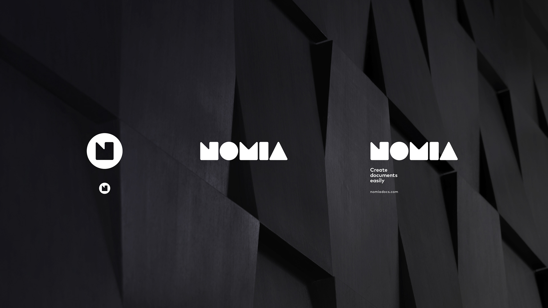
The intention with the word mark was to reflect the Nomia name using the simplest shape forms. The rounded corner look creates an approachable and consistently smooth look across all the elements in the visual language.
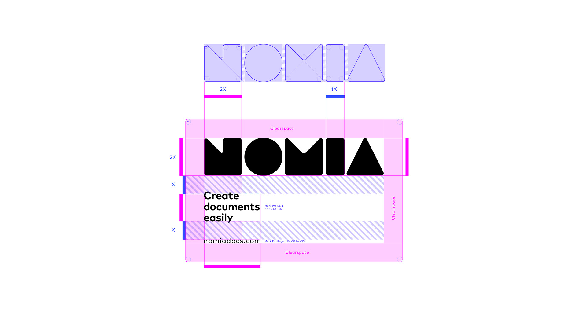
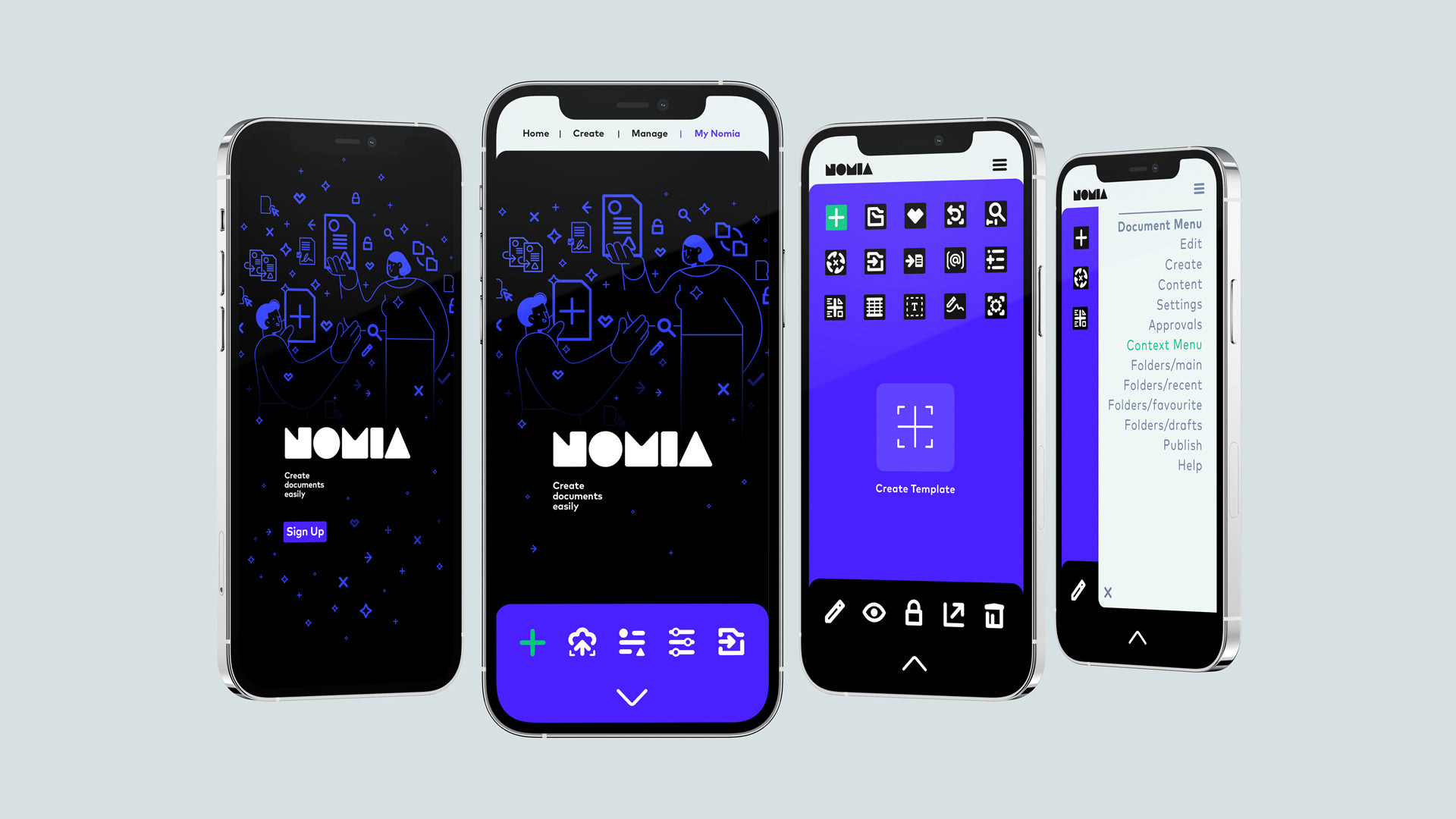
Adaptable to your needs
The logo lock-up uses a modular upscaled approach from a simple N monocle to a full word-mark that locks with descriptors, urls and holding shapes. This enables the client to use various configurations depending on the needs of the medium, yet all still within the Nomia language.
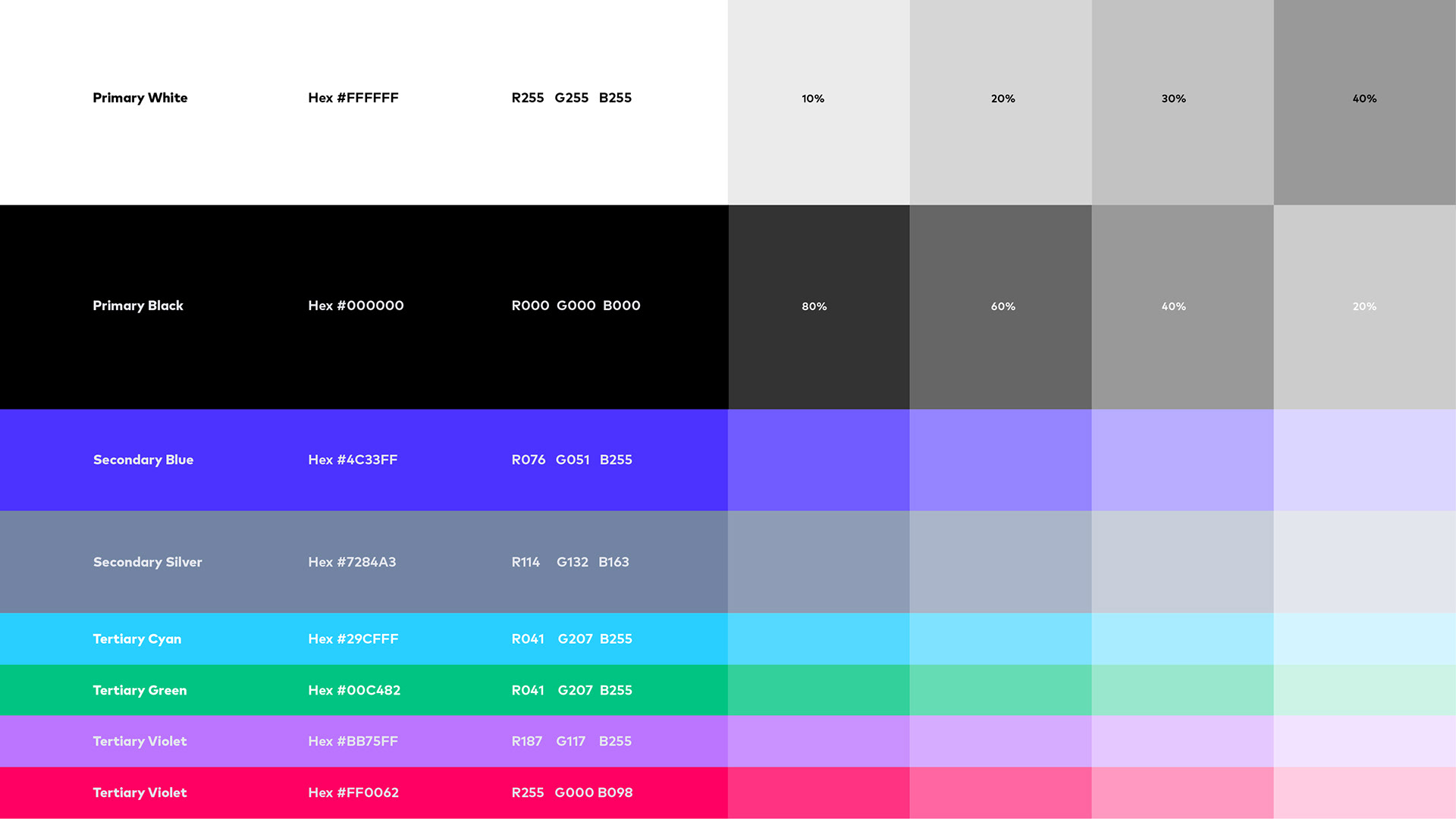
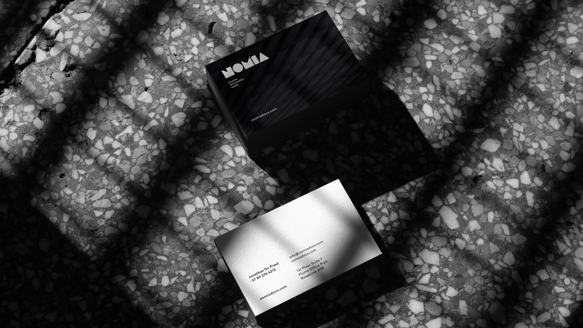
Black & white with a bit of zing
The colour palette is elemental, using primarily black and white but highlighted with modern, digital, secondary and tertiary statement colours.
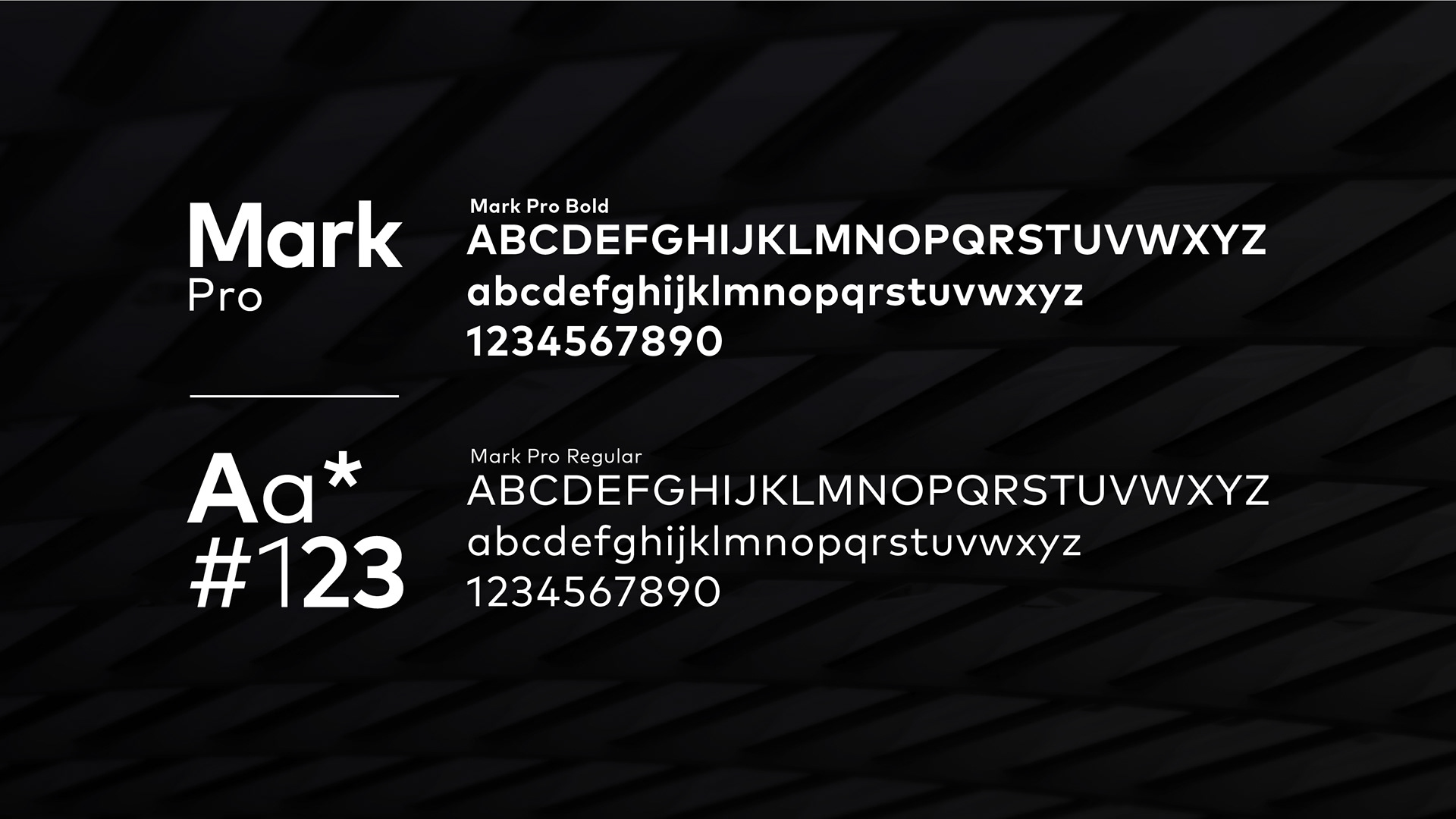
Make your mark
Mark Pro was the preferred font for this identity because of its primary shape like quality derived out of circles, squares and triangles, it has a simple, friendly, modern feel to it and compliments the primary word-mark very well.
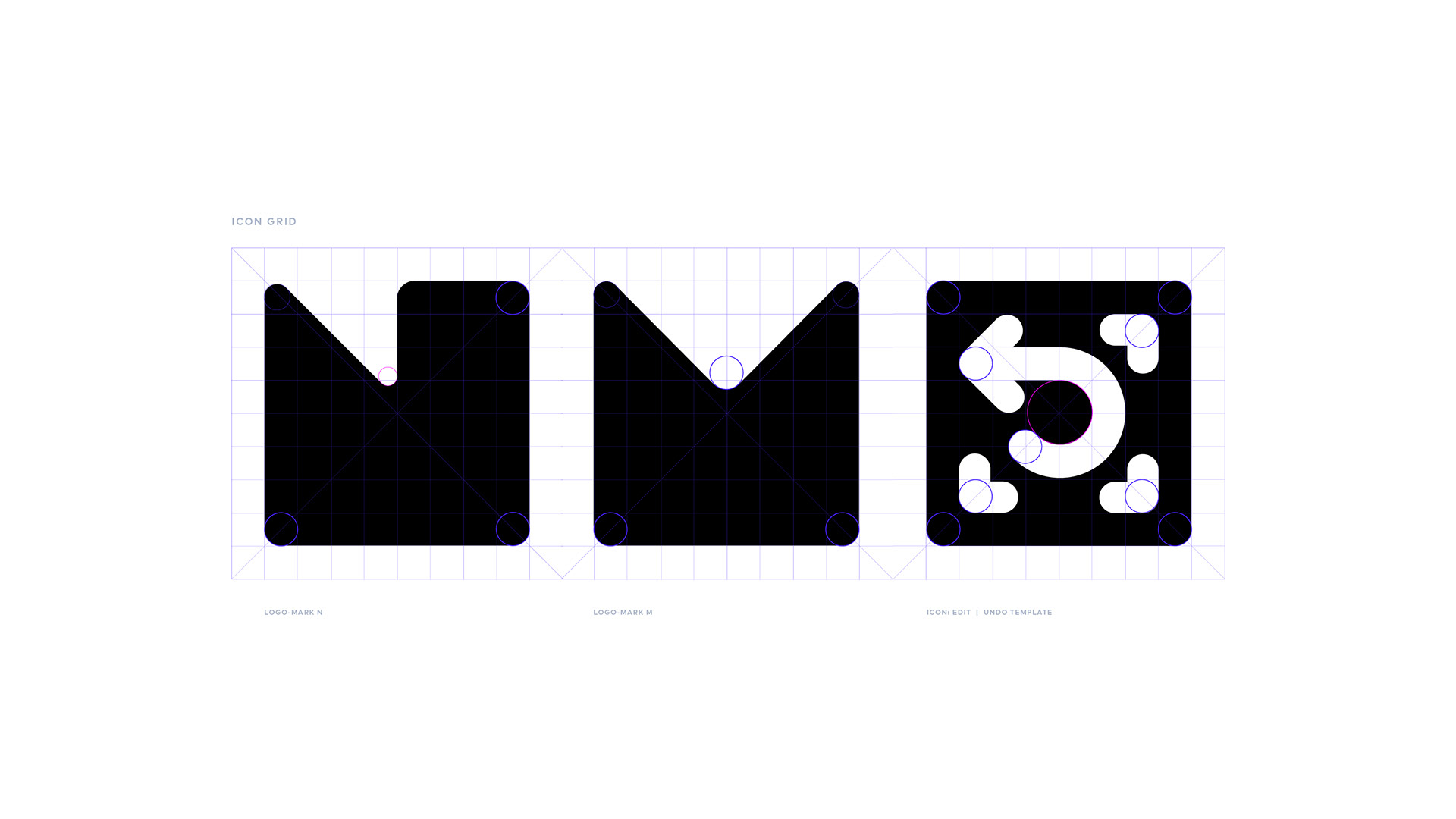
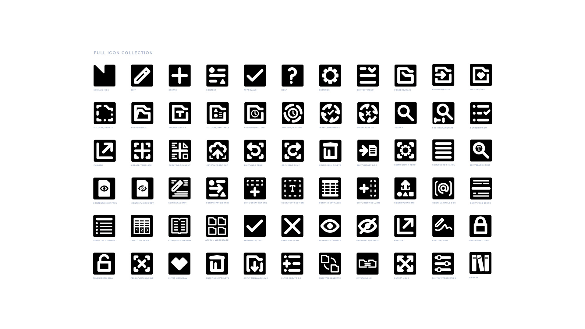
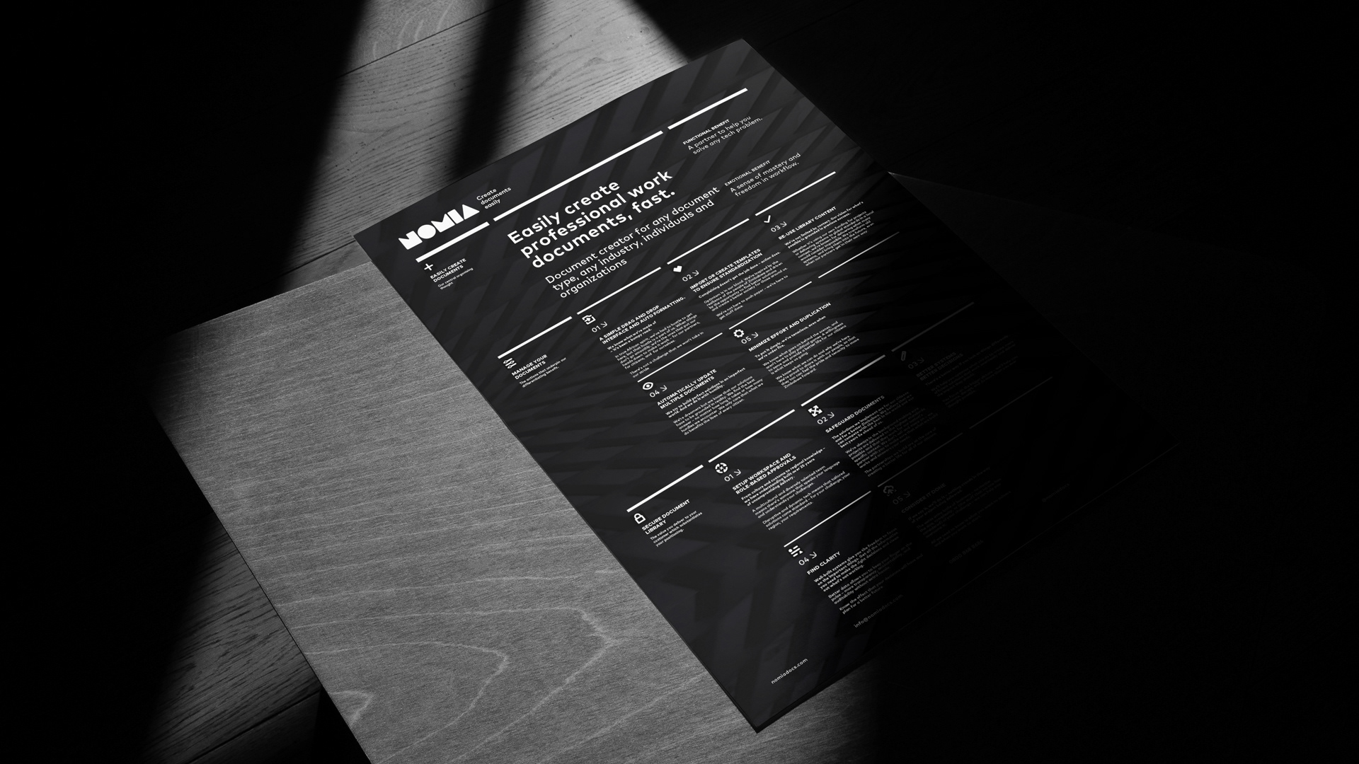
Another way to communicate
An icon language that takes its form and feel from the primary word-mark letterforms was needed as an integral part of the visual language.
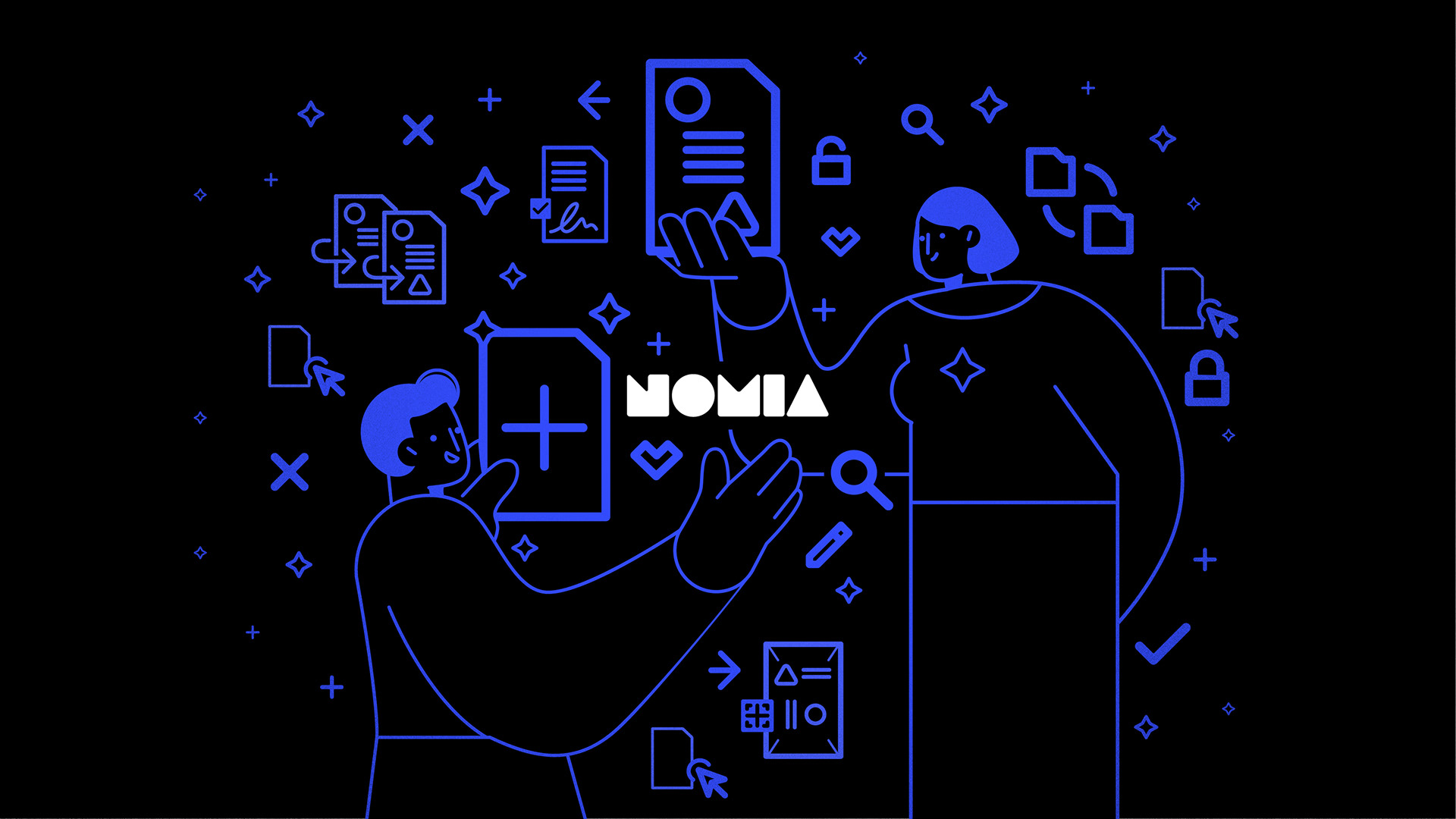
A picture says a thousand words
It was felt that Nomia needed a pictogram language to explain some of the apps usability. It also created a necessary pattern language that could be used for various media across the visual language. Eunomia is the Greek Goddess of order. We subtly incorporated this theme into the narrative.
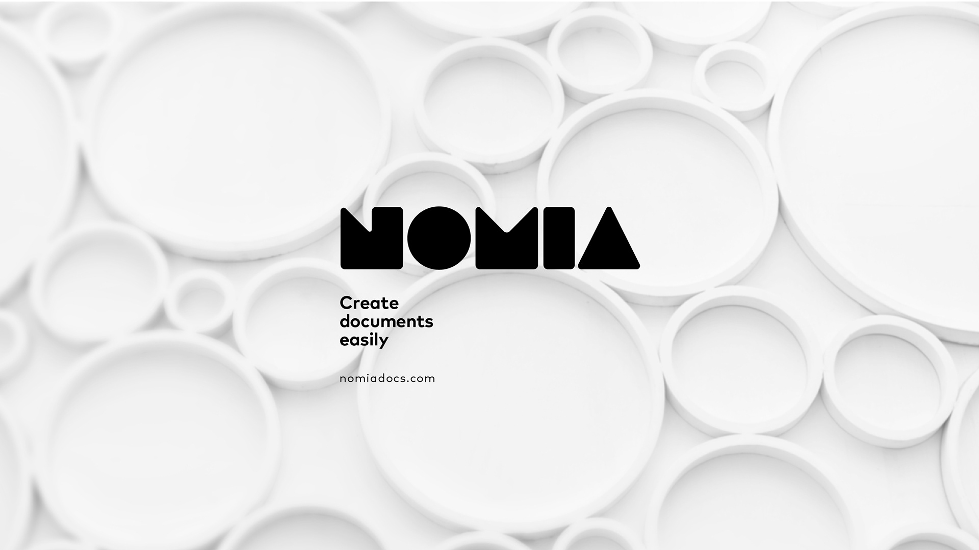
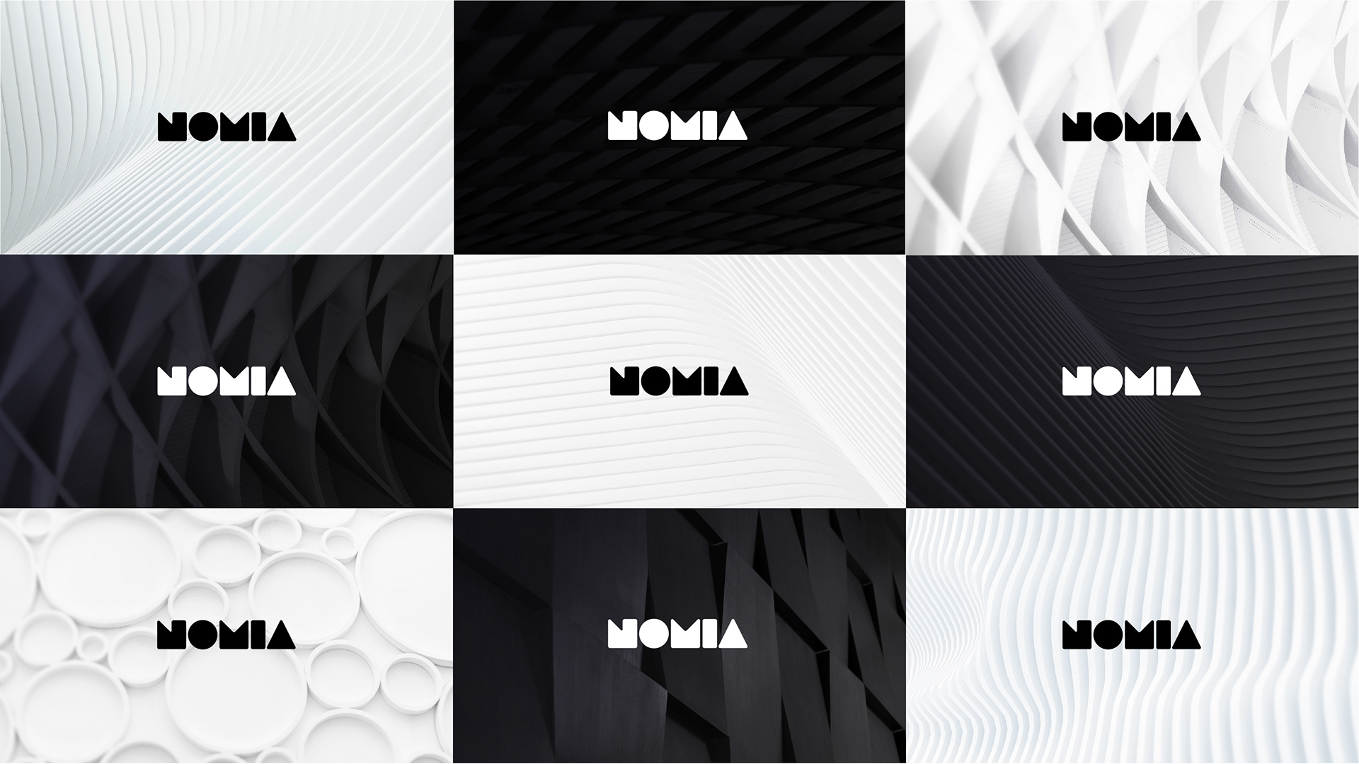
Elegant abstraction
A secondary photographic language was created to counterbalance the illustrations, these where used mainly as abstract backgrounds that gave the brand a sophisticated tech feel. This photographic language was particularly helpful in holding the corporate stationery and other brand elements together.
A word from our client.
"Finchdesign created a brand that perfectly represents and portrays the philosophy of our business and our software solution. We cannot be happier with the end-product as well as the professional and creative approach taken by Finchdesign guiding us through the process of creating our brand and corporate identity. The deliverables provided have enabled us to kickstart our digital marketing campaign and create a professional website that is visually appealing. Thank you so much!"
Jonathan Du Preez. CEO.