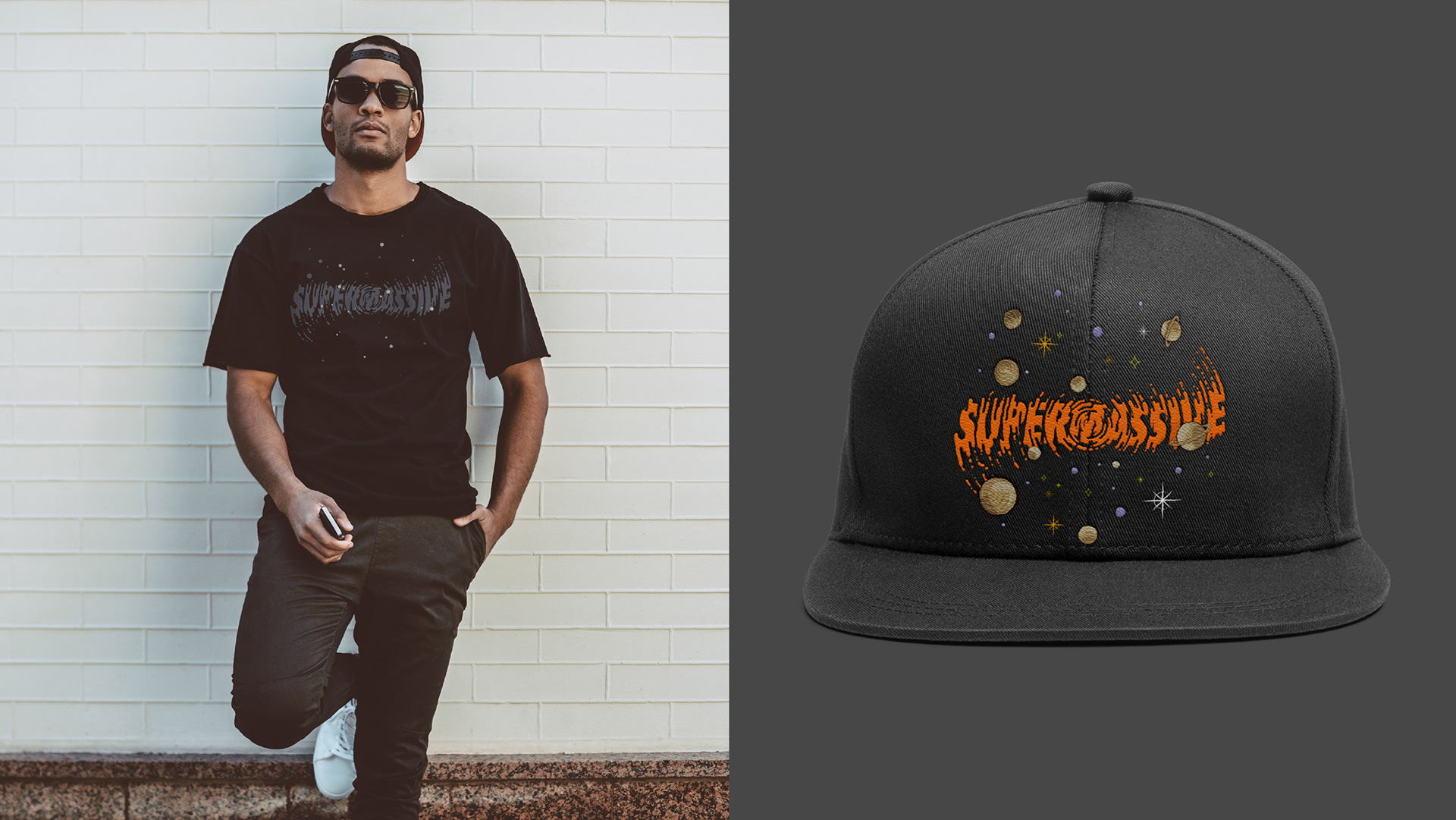

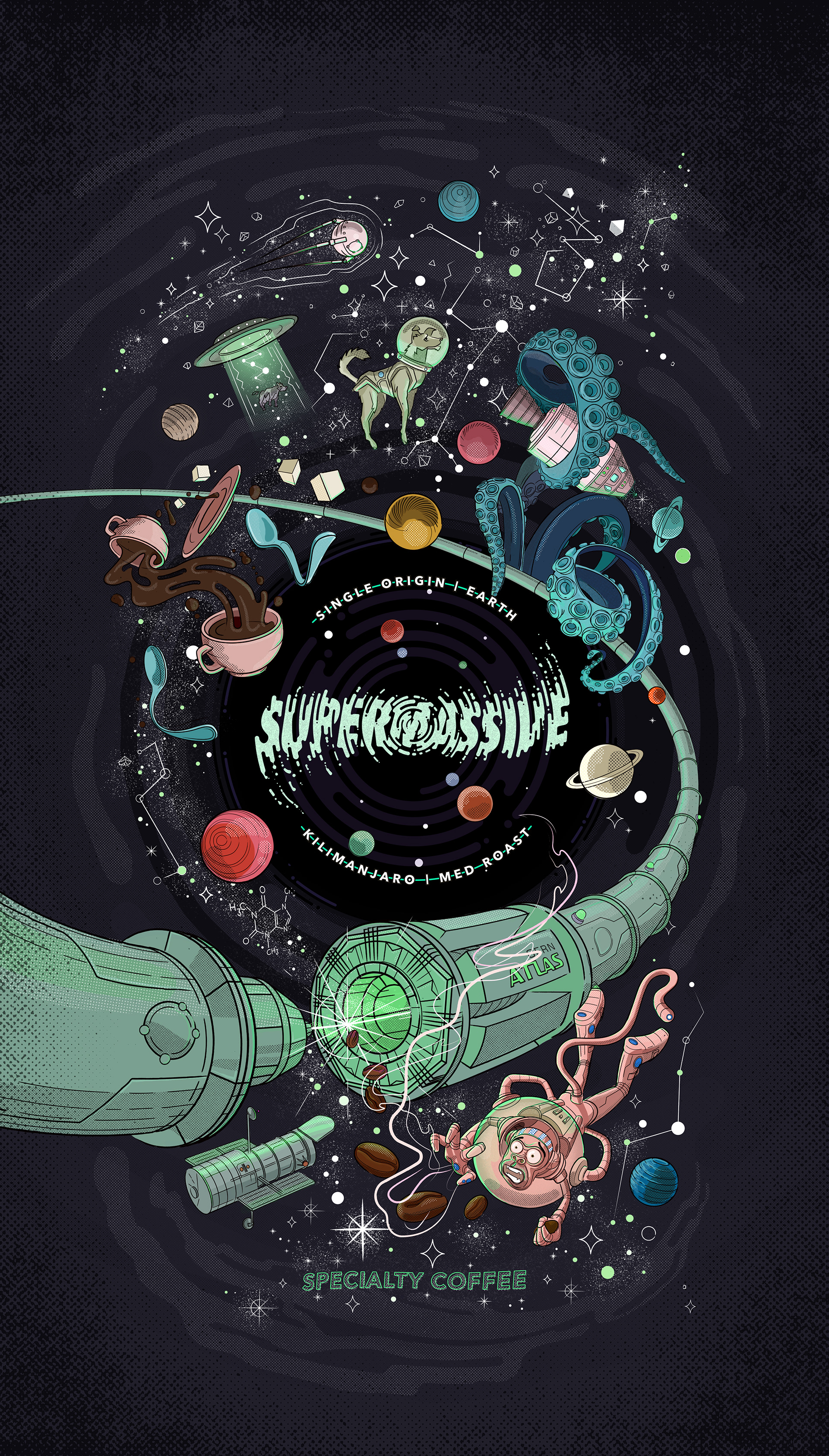
Supermassive Coffee Roasters explores the deep dark corners of space within your coffee cup.
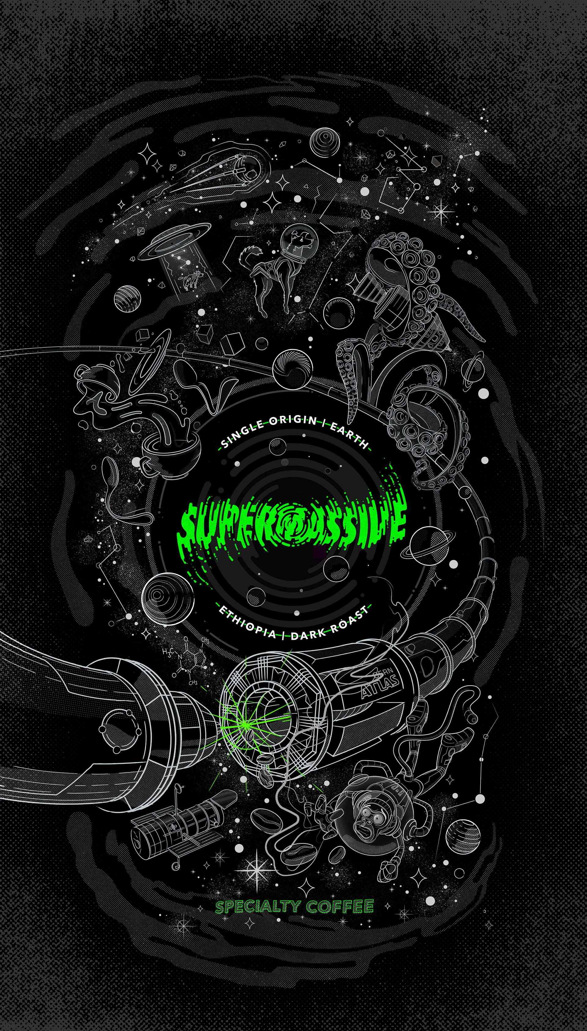
A family team that combine their love for coffee, retro comics and intergalactic space science. Supermassive wanted to celebrate our collective search for new frontiers with icons like Albert, Laika, Apollo, Hadron, Sputnik and Hubble.
It was a challenge to get all these characters and ideas to work in a cohesive identity. We chose to create a custom type-mark that is supported with an engaging, fluid, retro-style illustration. The narrative was to convey visually that a lot of greatness and mystery goes into a cup of their specialty coffee.
Client: Supermassive Coffee
Corporate Identity, Illustration & Visual Language
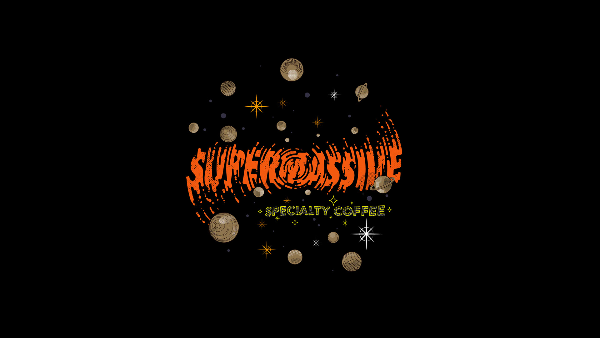
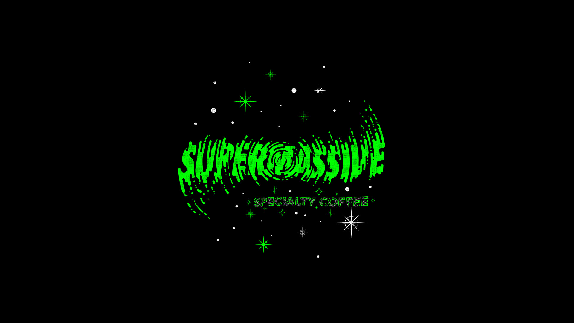
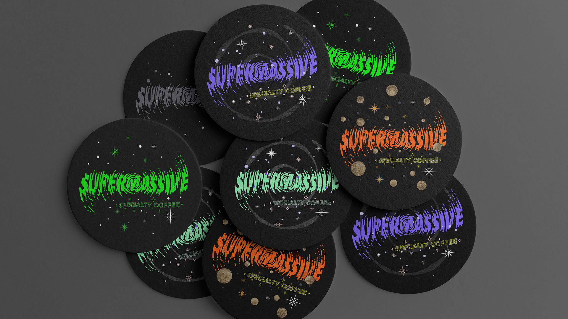
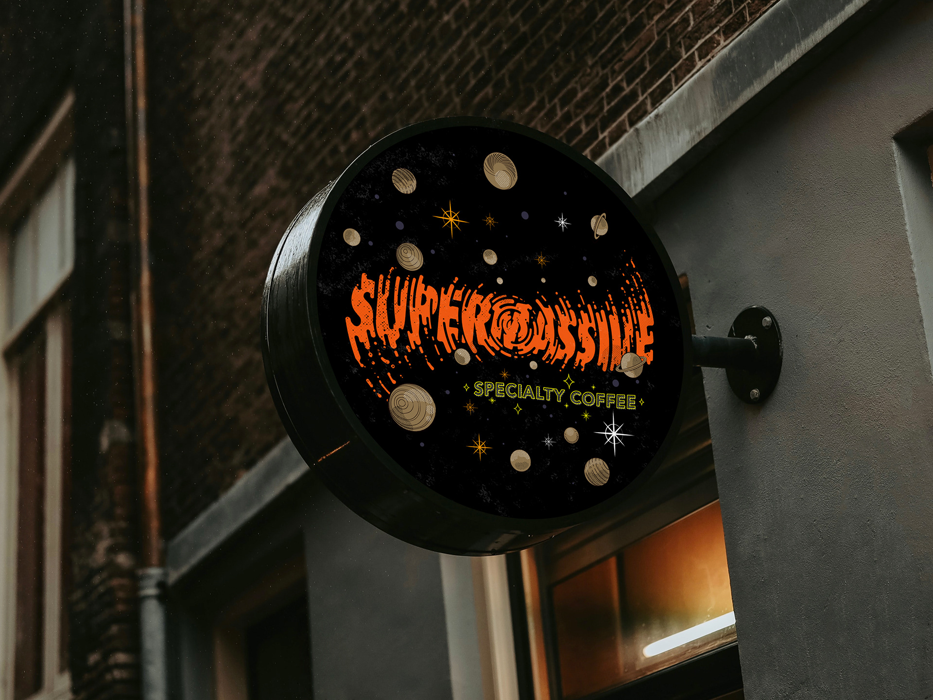
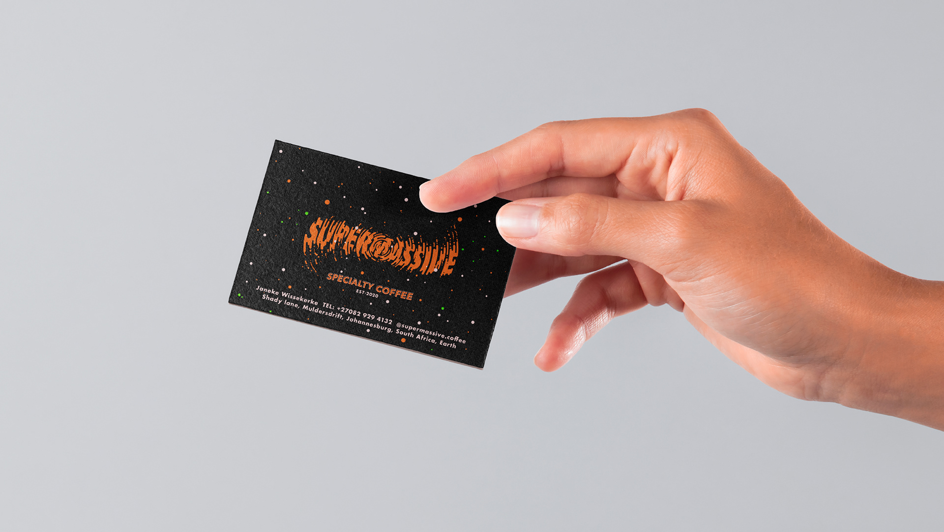
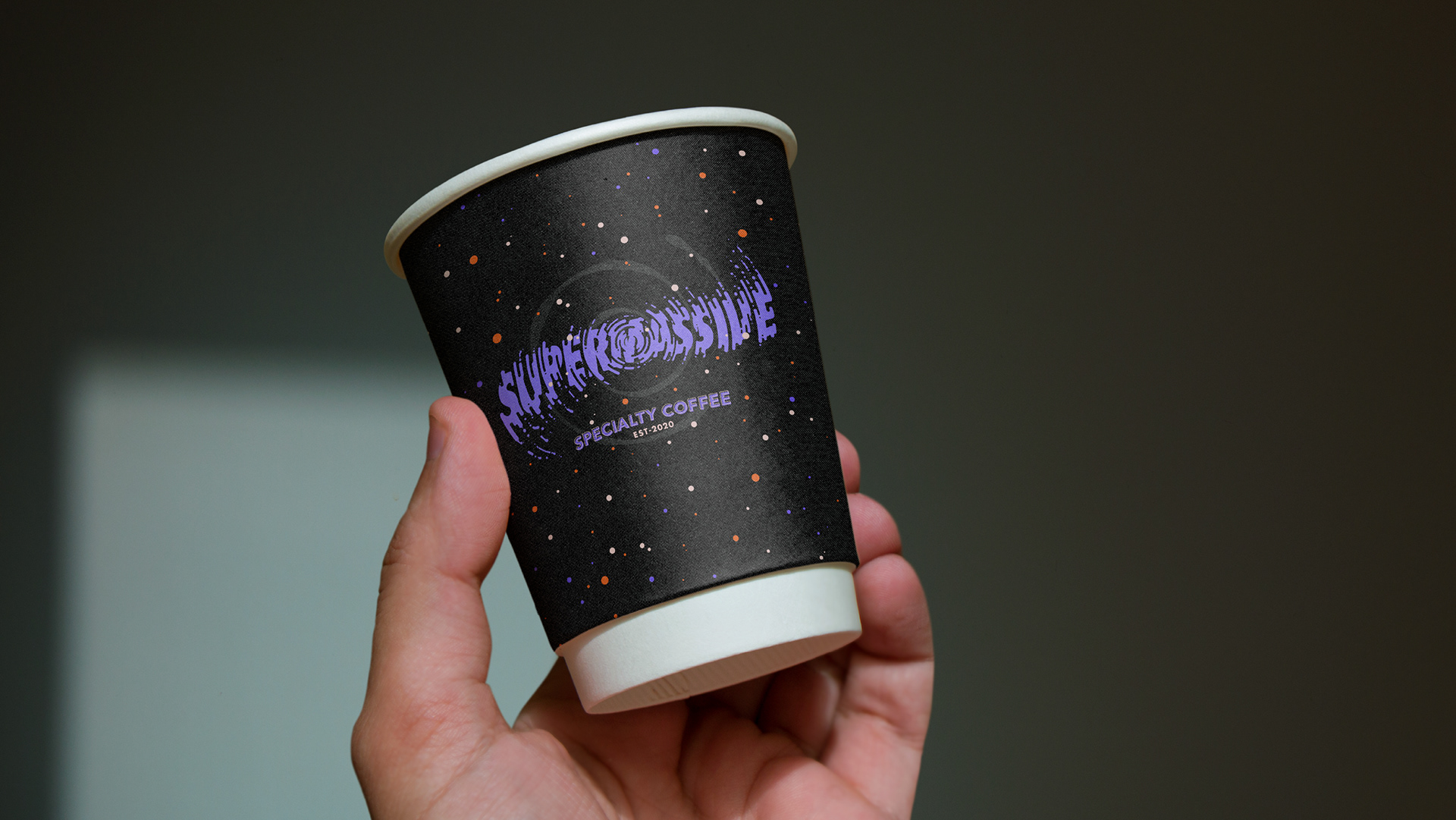
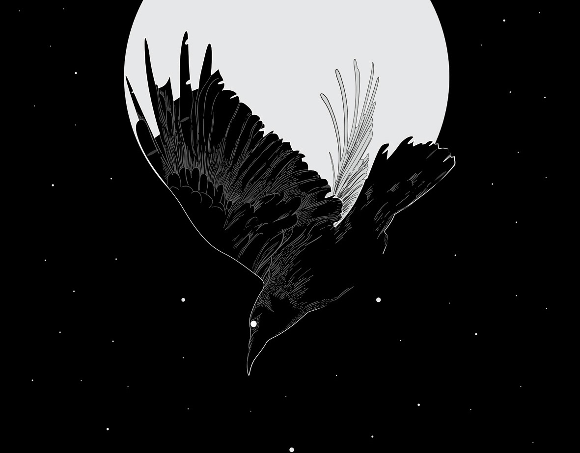
A portal to another dimension.
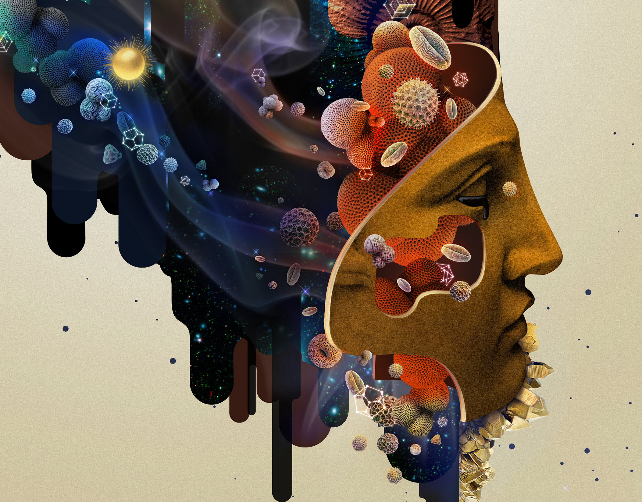
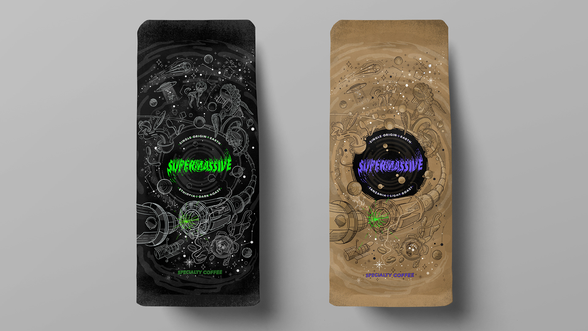
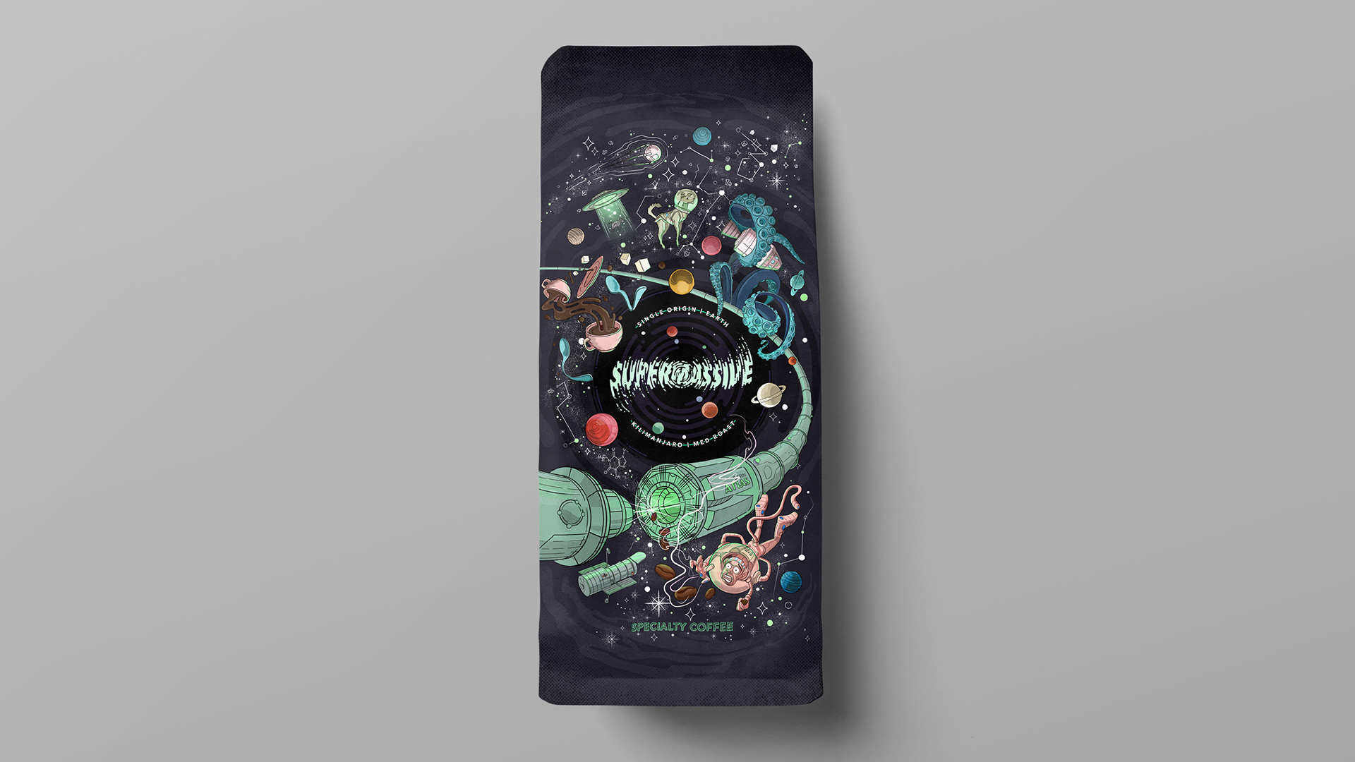
I was challenged with creating a visual language that relied heavily on a narrative rich illustration about inter-dimensional space exploration. The idea being that everything is being pulled into a Supermassive black hole, representing the top view of a coffee cup. Each flavour profile has its own loose colour scheme which adds to the overall vibrancy of the brand.
Pushing the brand beyond the ordinary
This identity really leant itself to a range of fun signage applications and promotional items, the point was to create a language that customers would want to take home with them and use with pride. This creates a symbiotic branding experience where the public do the marketing job for the client without any effort or cost.