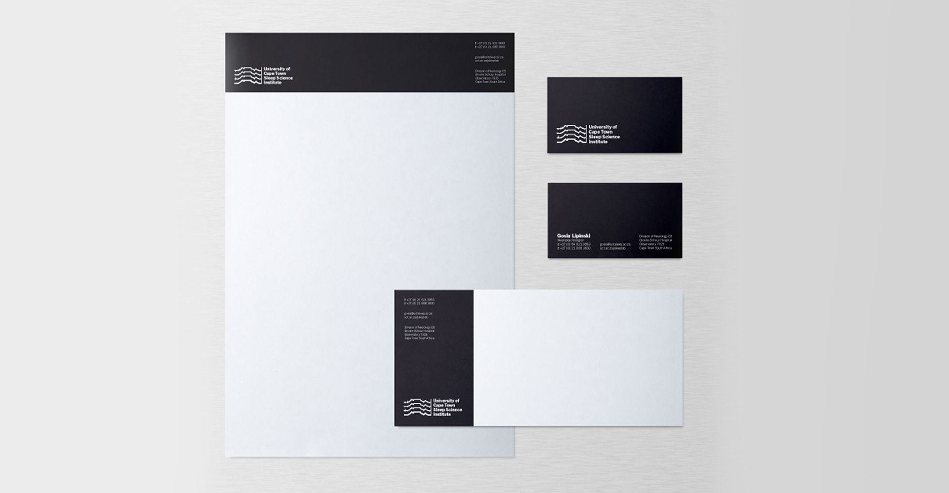

I had the opportunity to design a logo for the University of Cape Town Sleep Science Institute. Its a field of science that Im very interested in, it was a very loose - open brief, our goal was to create something conceptual for them yet still restrained and highly functional. My feeling on this project was that a decorative aesthetic look would soften the seriousness of the field, I didn't want the identity to come across as trivial and "Fun". I chose instead to exclude anything graphically that didn't need to be there, instead resorting to basic signage style iconography and no - fuss informative type. I believe this approach added to the look of legitimacy of this department of science in UCT.
Conceptually, for anyone who is a resident of Cape Town, Table Mountain is the most notable feature of the city, UCT is literally situated at the foot of the mountain, I saw an opportunity to combine the visual connection of the EEG with the distinct shape of the mountain.