
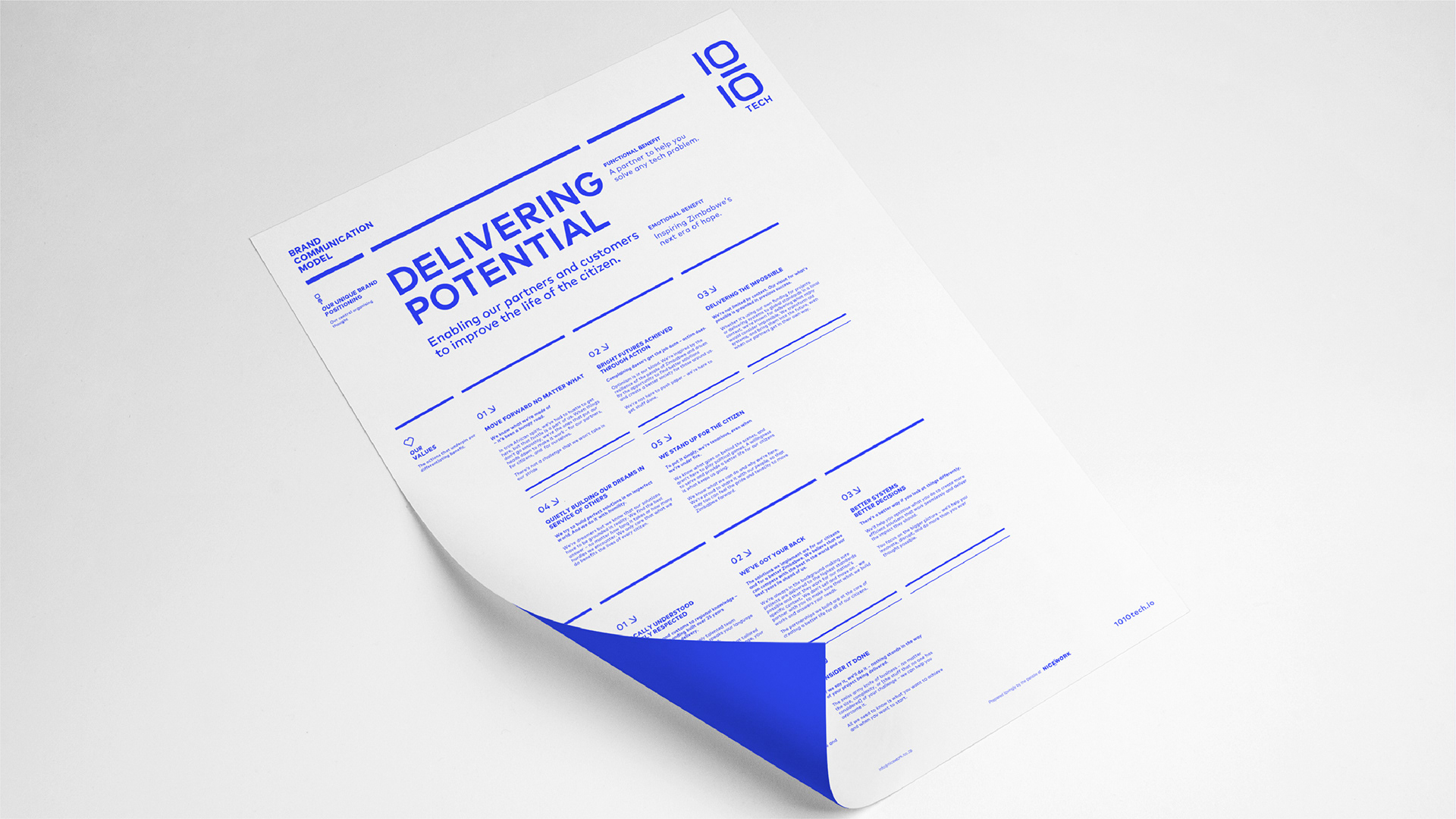
Delivering Potential
The client audits government infrastructure projects in Zimbabwe through data analysis. The company fights for the citizen to ensure projects are managed properly, come in on budget, streamline workflows and reach a clean audit at the end of the process.
The Name
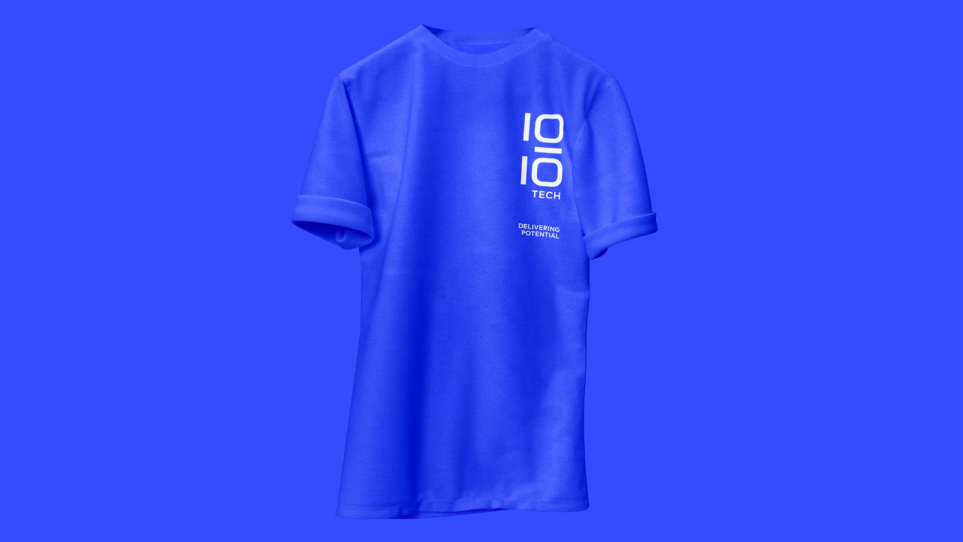
The first port of call was to give the client a new name. Their previous name meant nothing to the staff or the wider public at large, our task was to imbue the brand's name with meaning. (1010) representing data and (10/10) representing a perfect audit. 10/10 also signals to the internal team to reach for excellence in all their work by 'Delivering Potential' for the citizen. The Ten-Ten-Tech alliteration rolls well off the tongue and is practically unforgettable.
The Concept
As the main conceptual legwork is dealt with by the name, the goal was then to visually represent these standards through type, colour and a comprehensive visual language. It was important in this case not to cloud the thinking by burdening this identity with unnecessary fluff. It's straight to point.
Stylistically, it's future-forward, bold and empowering. It has a look of a company that is driven by leading edge technology and passion. This leaves the public and stakeholders with no doubt now as to who and what 1010 tech stands for.
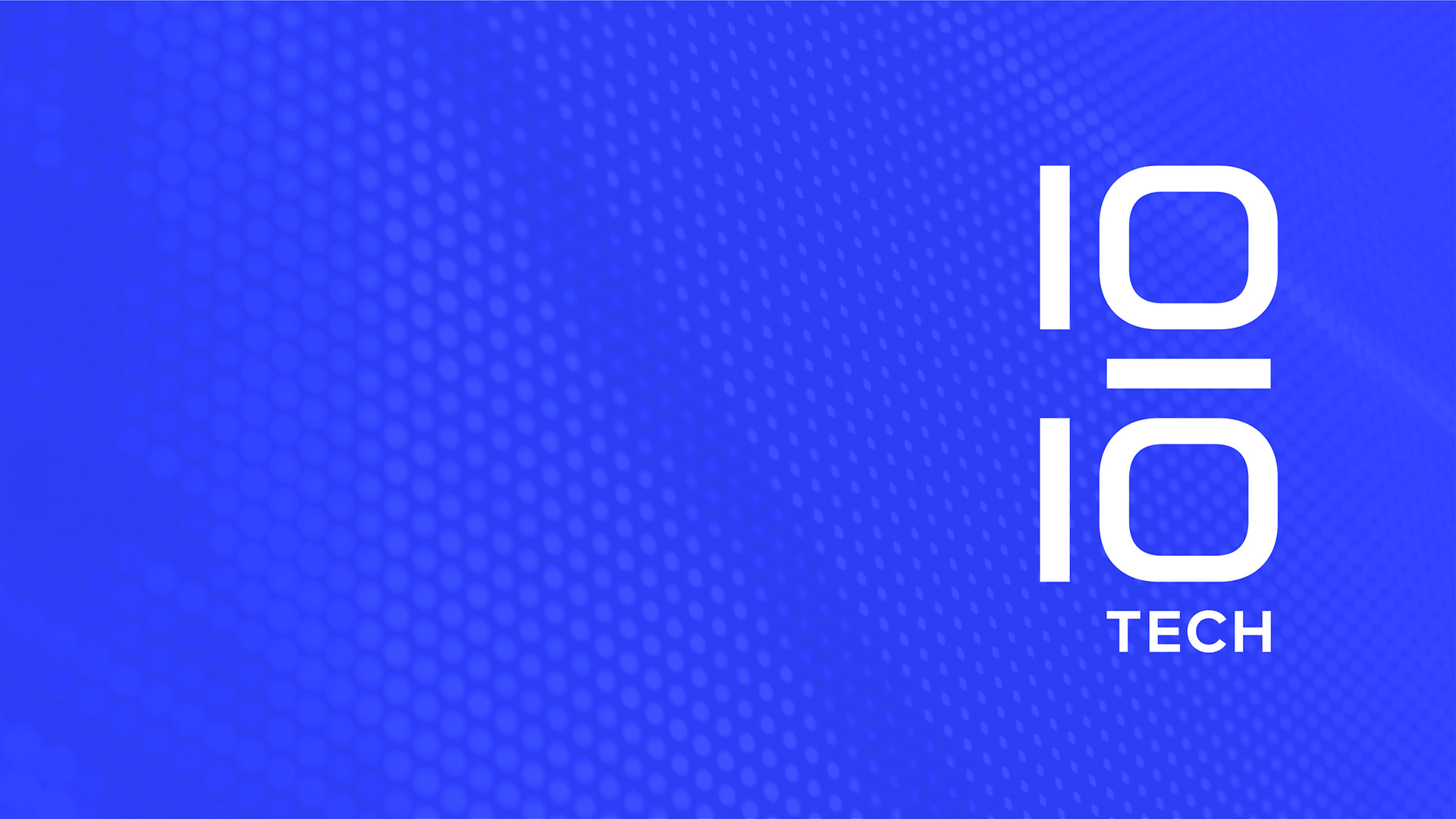
Client: 1010 Tech
Corporate Identity & Visual Language
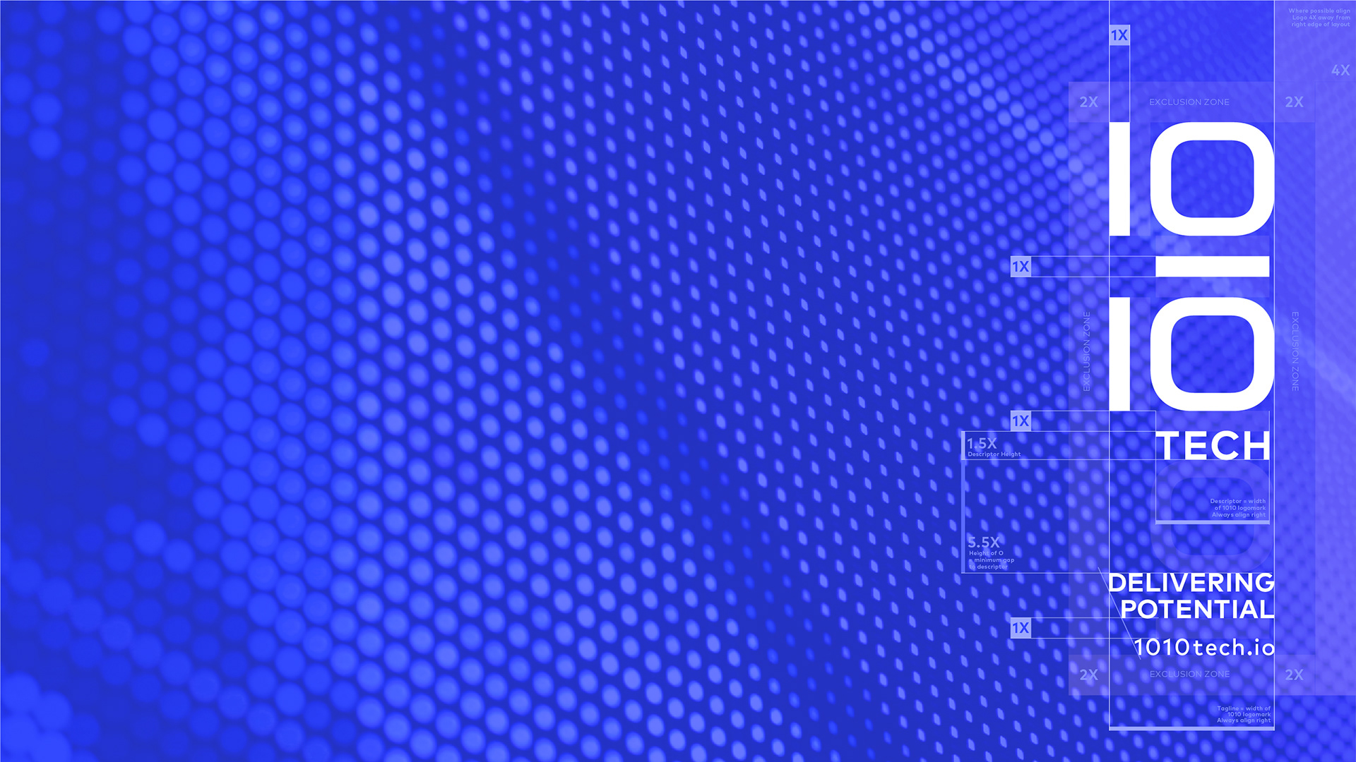
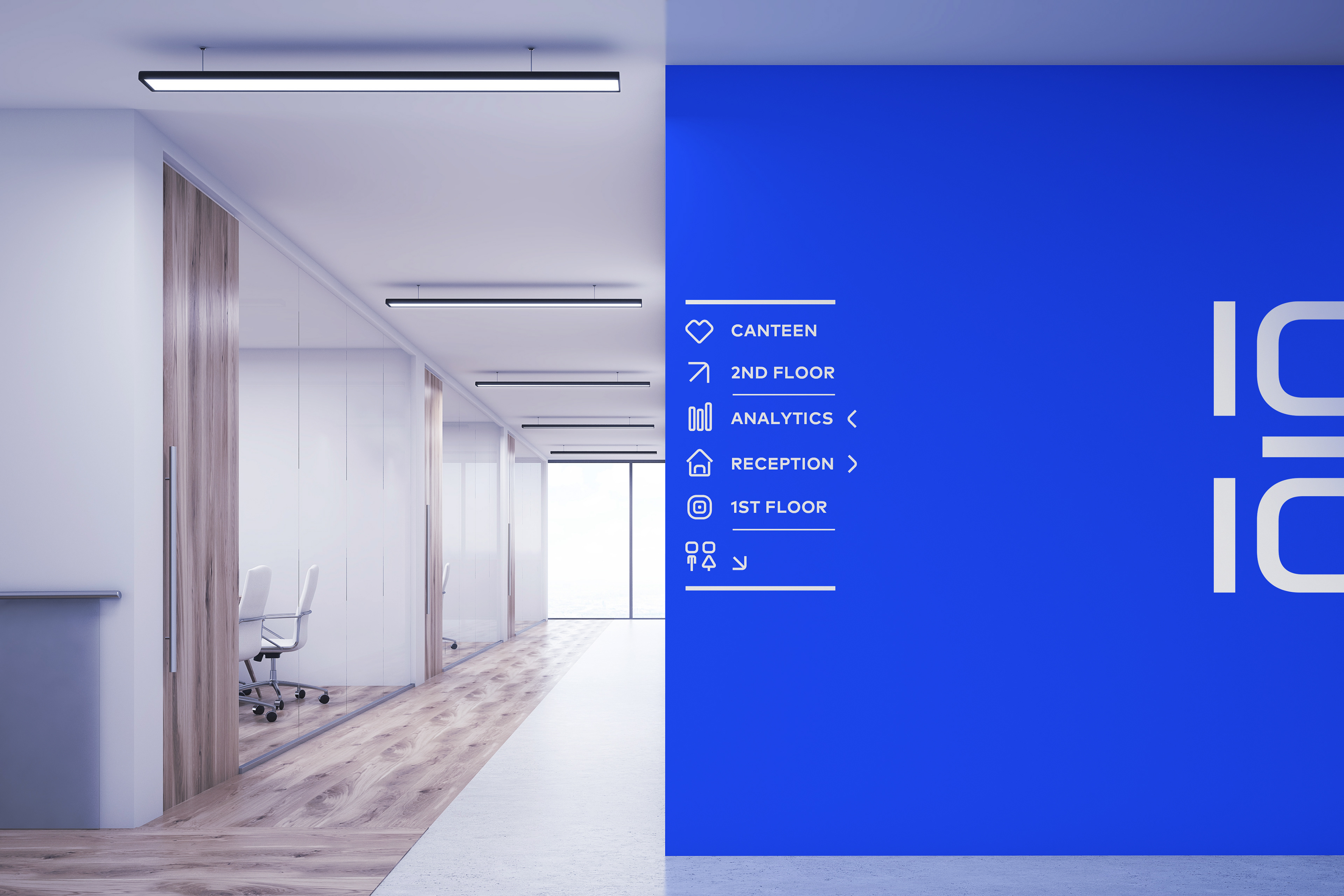
Look Right
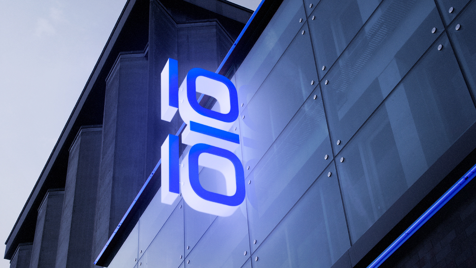
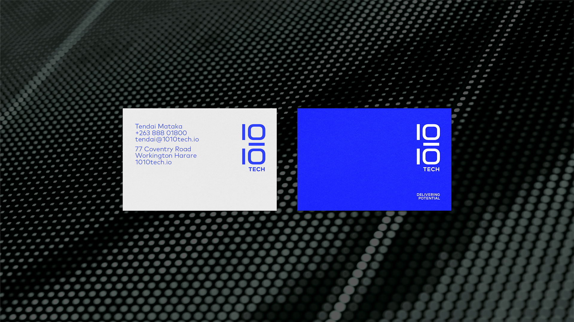
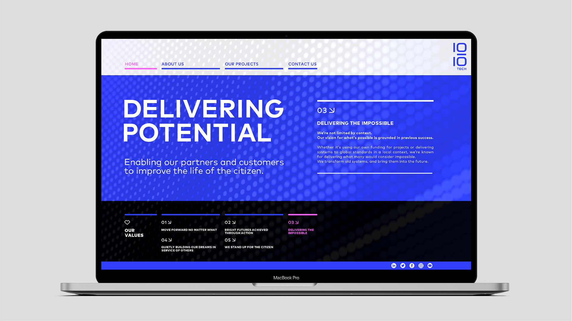
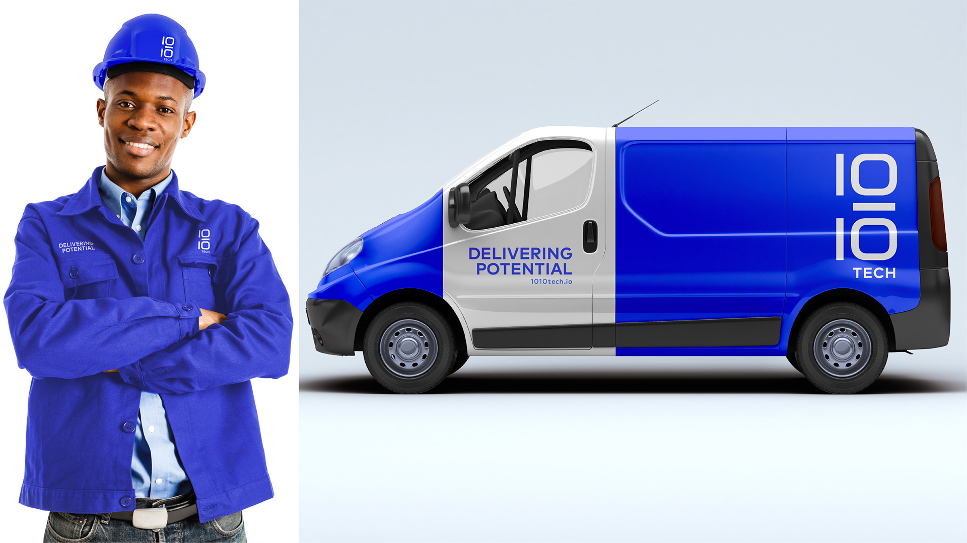
The 1010 Tech Identity has a right aligned lock up system that is modular. It can be represented by the wordmark on its own or harnessed with its pay-off and url descriptor. The right hand side alignment goes against convention and is a point of difference that is carried through all touchpoints for the brand.
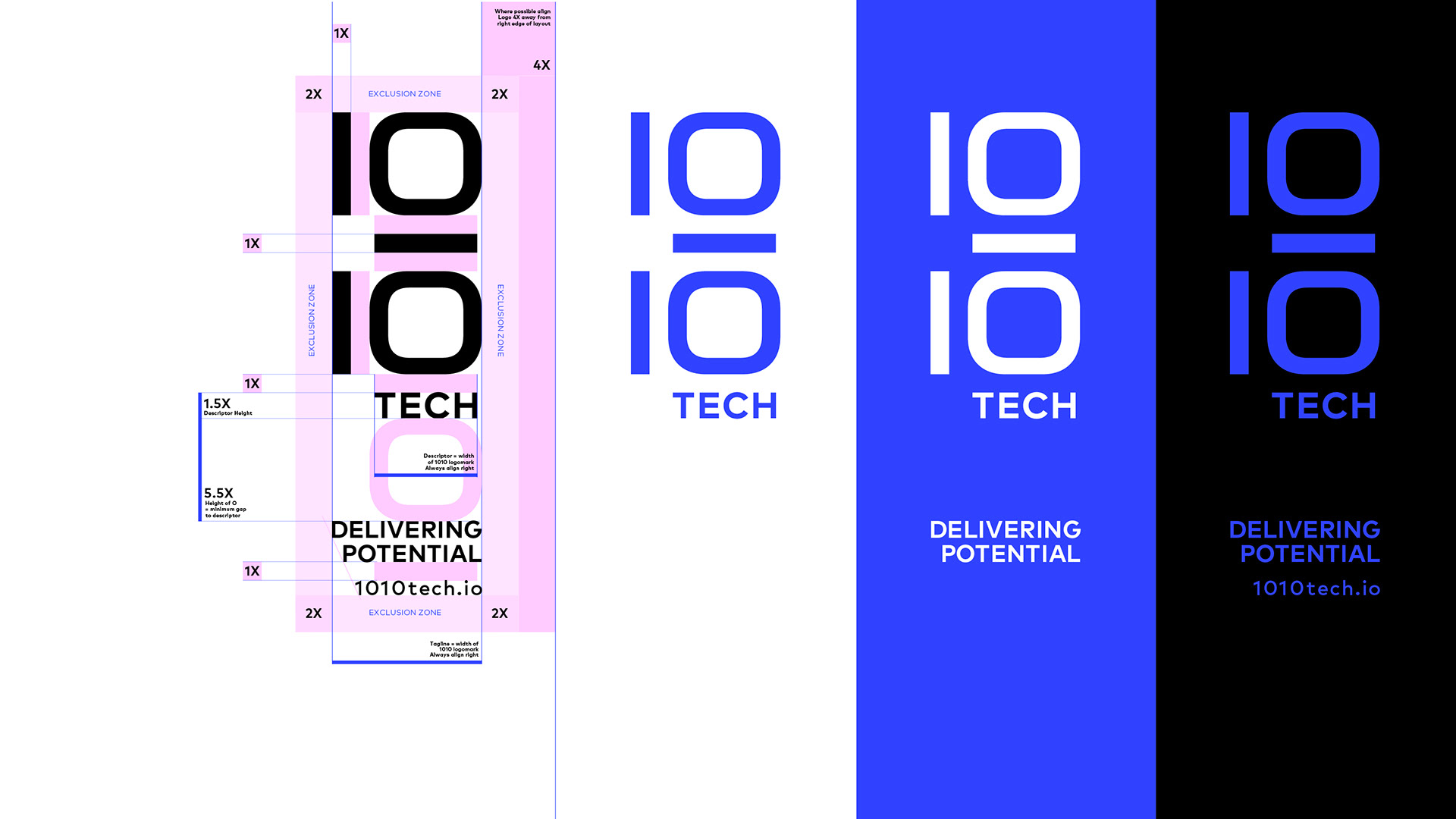
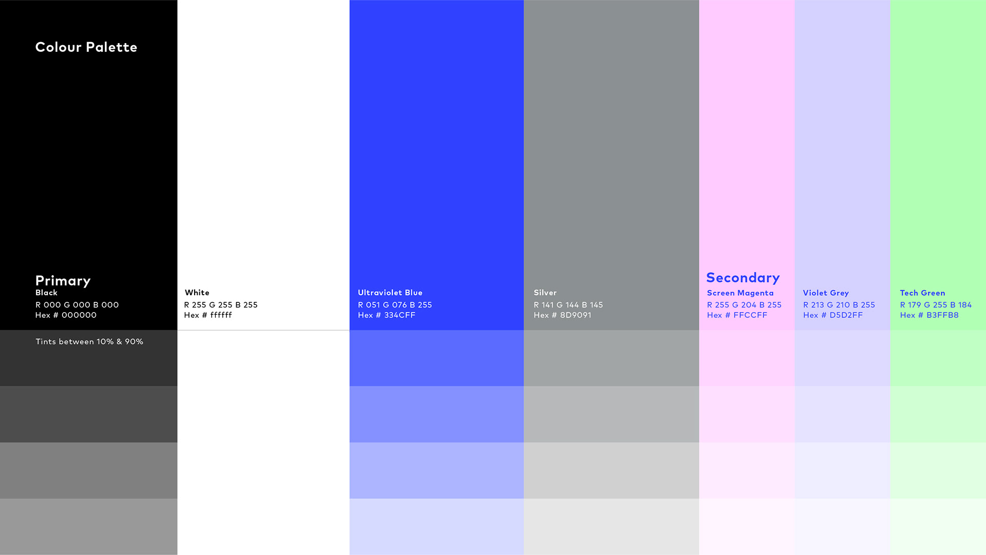
Be Bold
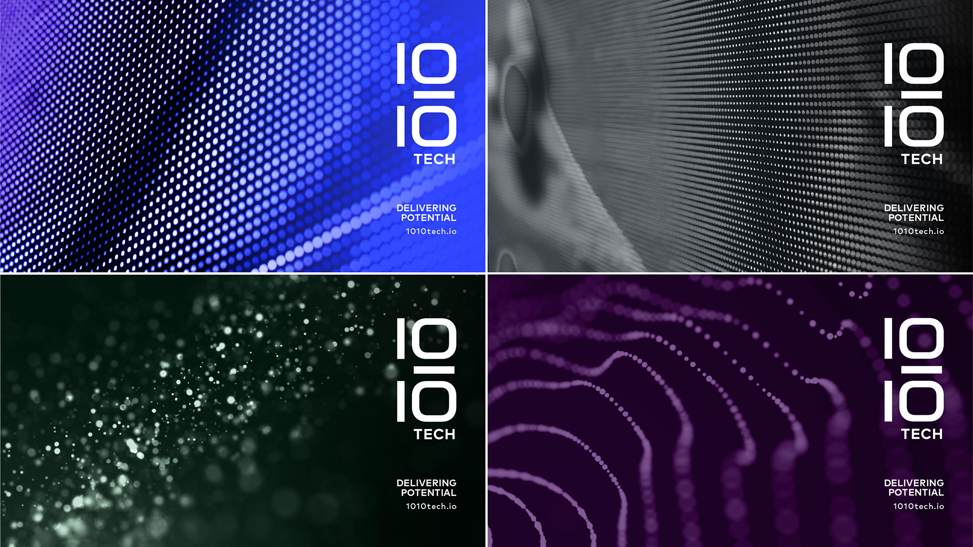
The bold and unapologetically powerful colour palette is derived from elemental digital screen values to accentuate the technology industry feel that 1010 tech operates in.
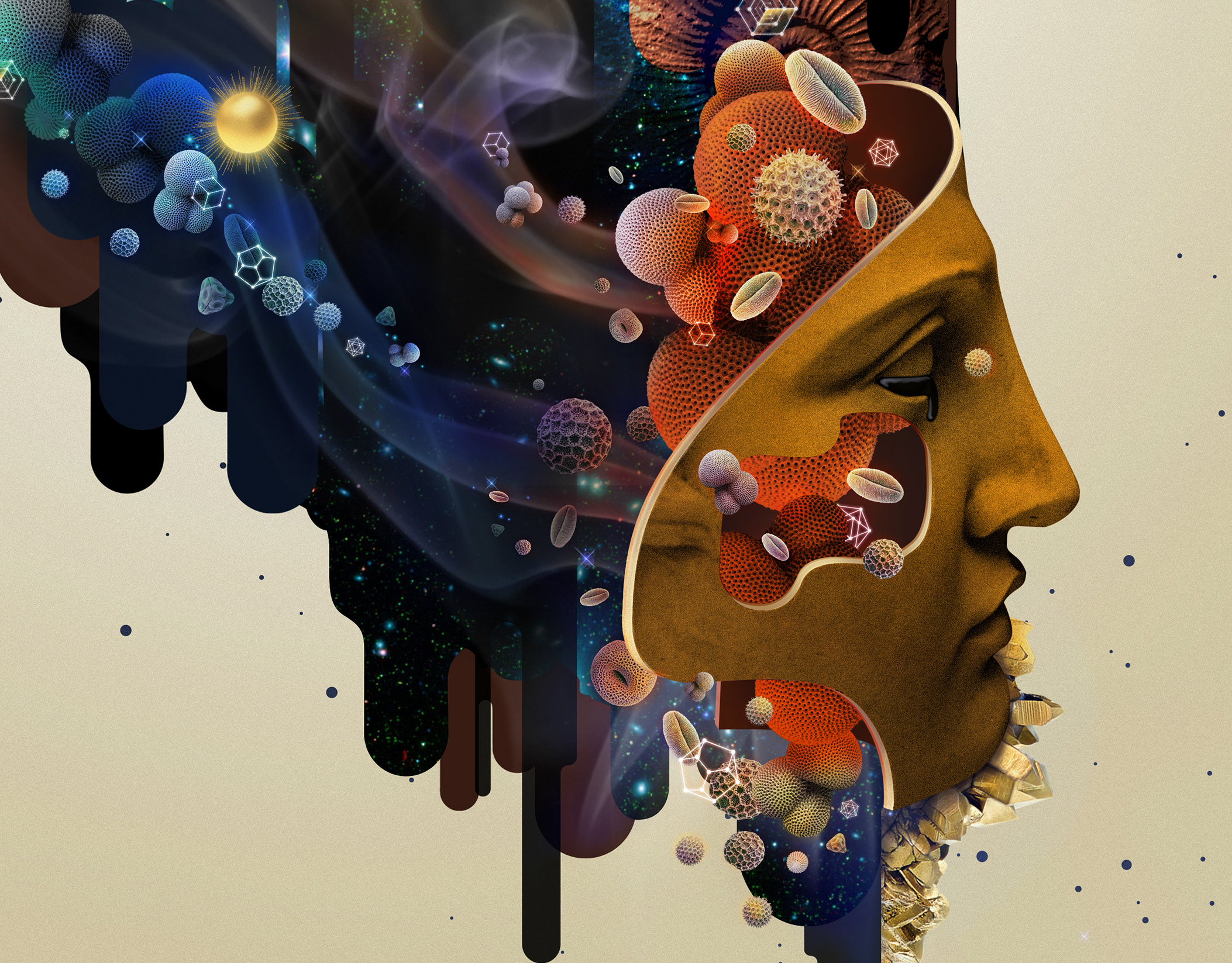
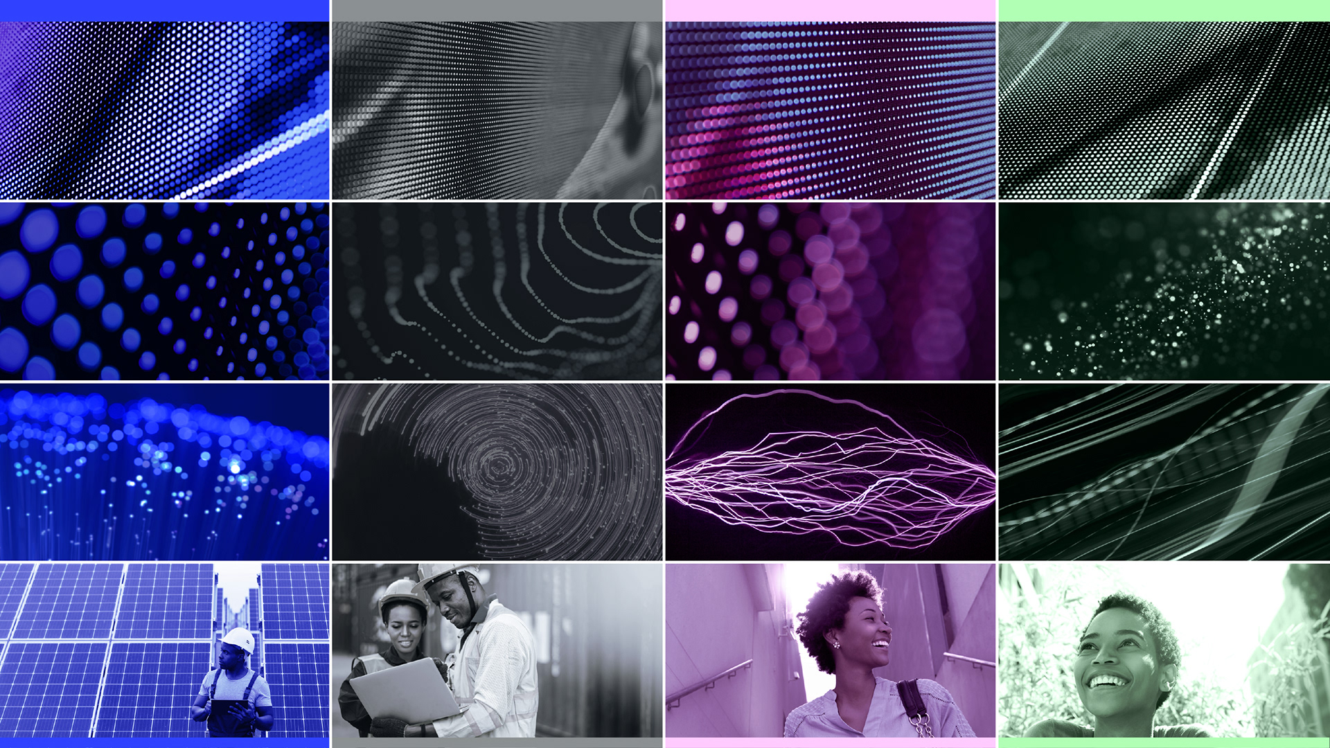
Abstract Expression
Our photography treatment consists of 4 main grades, influenced by the primary and secondary colour palette. It is a majority split between dynamic, digital, abstract imagery and minority of customer focused imagery.
Consistency is key
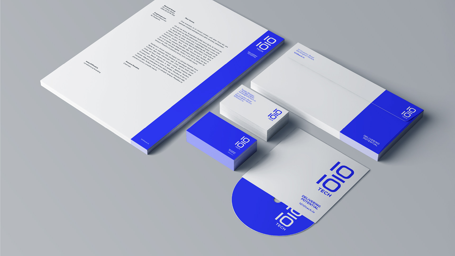
Our right-aligned grid system translates into a cohesive language that sets the brand apart and carries across all stationery and presentation elements.
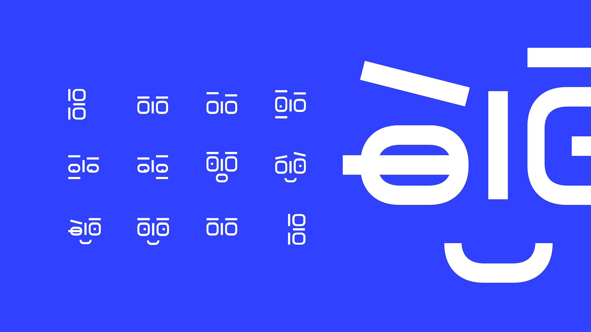
Uniquely Iconic
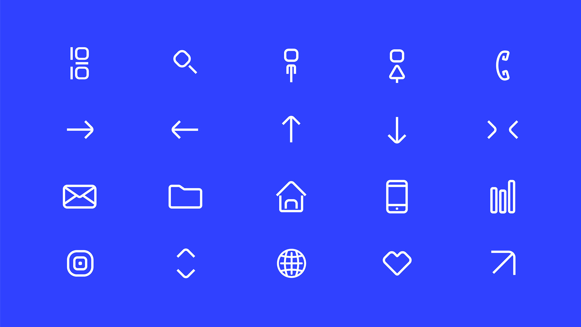
An Icon language was needed to help explain the various narratives the 1010 tech wants to tell in its communication. The icons where custom made to reflect the forms of the logo and act to reenforce the style of the main logo mark.

Hello there!
A friendly local brand ambassador we named Tendai was also created using the shapes and forms of the original logo mark. He adds light and interactivity to presentations, internal staff orientation, future social media and advertising campaigns. *Animation by David Hiller @ Nicework david@nicework.co.za
Delivering Potential
Here we see more examples of how the 10-10 tech visual language comes together.
Done in partnership with the lovely folks at Nicework.